
A professional website needs a modern and high-end design. And modern web design elements should be up-to-date and meet users’ requirements. Using these elements helps aid a seamless and beautiful website experience. Every day the audience demands something exceptional from a website design. The latest web design trends are more user-friendly, organized, and progressive.
Since having a website has become crucial for businesses, putting some content and creating a few pages won’t be enough. Your website design should be excellent to build a top-notch online presence. Web design elements are potent tools to attract more viewers.
This blog discusses 15 essential web design elements to improve a website’s functionality. Read on to learn more!
The Most Crucial Web Design Elements to Check Out In 2022
There are hundreds of web design elements to enhance your website. To help you find the best ones for your website, we have compiled some of the finest modern design elements to boost your website’s performance.
- Background Videos
Automatic background videos can add lots of appeal to a web page. You can use them for storytelling and lowering other content you require to describe your business. These videos help viewers understand the primary facts about your business.
Moreover, some people don’t want to read lots of texts. For them, videos are more convenient and effortless to understand the critical points of your organization.
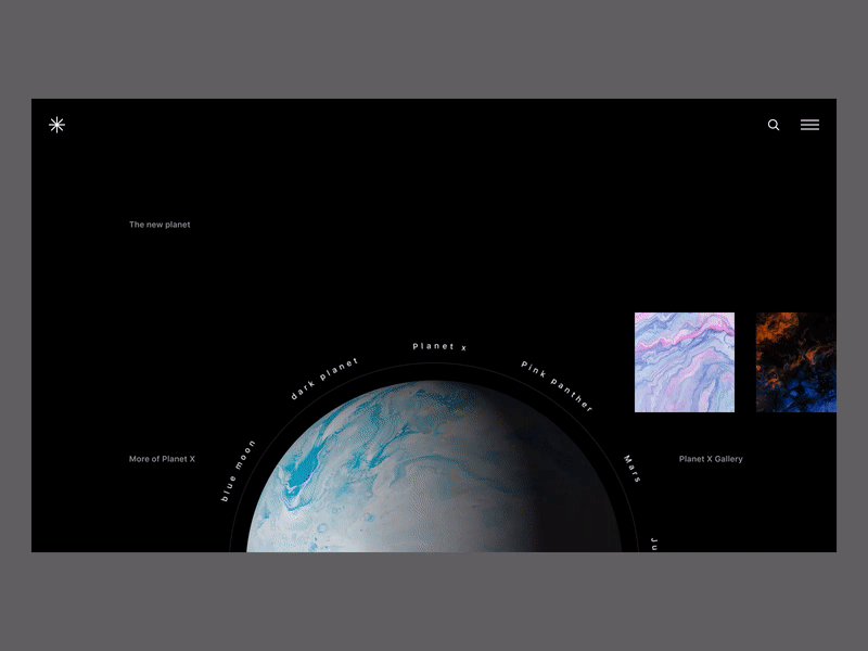
- Bold Color Scheme
Bright, bold colors enhance the appearance of a modern website. Hence, select a color scheme for your website according to your brand’s tone. Some shades reflect particular emotions.
For instance, blue showcases genuine authority, security, and confidence. Therefore, many websites choose blue as their color scheme. Moreover, you can choose some unusual and extraordinary colors to grab the attention of more visitors.
- Rotated Texts
Rotated text is relatively standard in web designs. It is very eye-catchy and can provide an editorial appearance to your website. However, this text is not usable like marquees; hence, you can use it for decorating your site.
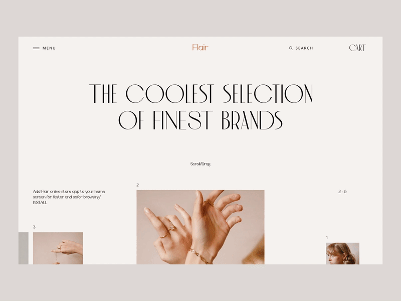
- Exceptional Typography
Most organizations choose specific typography or font to help their clients recognize them better than their competitors. Moreover, typography makes it easier for businesses to express their brands.
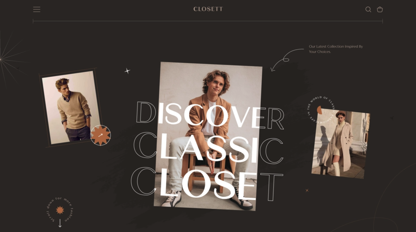
Typography provides a steady look all across the website pages. Your choice of typography showcases your brand’s identity. It shows whether your business is serious or fun or informative or functional. Whatever your font choice is, make sure your designer grants its implementation across devices and browsers.
- Minimalism
Sometimes people get confused between modernism and minimalism. Although they are different, they highly impact each other. While ‘less is more’ is minimalism’s principle, modernism pays heed to airy design, as streamlined and clean-lined as possible.
While designing a modern website, you should consider the concept of simplicity. And executing the minimalist principle will allow visitors immediately collect the data provided by you. Furthermore, a minimal design has lots of perks for a website.
- Seamless Navigation
Website navigation includes the assimilation of menus and links on the website. The navigation menu impacts the association between various pages and how conveniently visitors can discover them.
Since nobody stays on a website that is not intuitive, you should organize how people get everything on your website. So, keep navigation basic and responsive so that users may quickly access any section of the website that interests them.
- White Space
People usually overlook the use of white space in web design. After all, it can transform the whole website’s appearance. If you add lots of info or design elements to your website, it can confuse users, and they may choose to leave the site.
Adding white space helps users take a break from all content, as you allow them to breathe and be ready to read the next paragraph. In short, this web design element is a highly crucial visual break. It sets a clear view and reduces all distractions that prevent people from browsing a website smoothly.
Using white space is mandatory for designing modern websites, as it helps users go through relevant data that they may overlook in a hurry. In other words, white space makes web pages look more airy and streamlined.
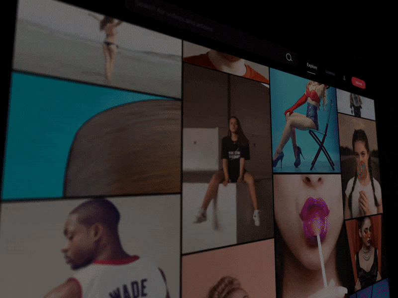
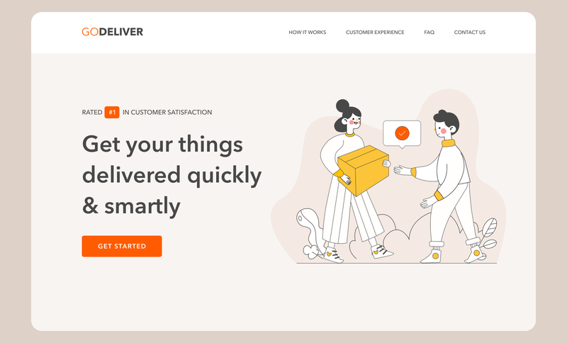
- High-quality Images
To enhance the visual appearance of your website, you need to lower using lengthy texts and add intriguing images. Such images can grab users’ attention toward a modern website and help you make them your clients.
Make sure to add high-quality images to your website to describe the story of your business. Product images can seamlessly communicate with visitors and convey the message you want to deliver.
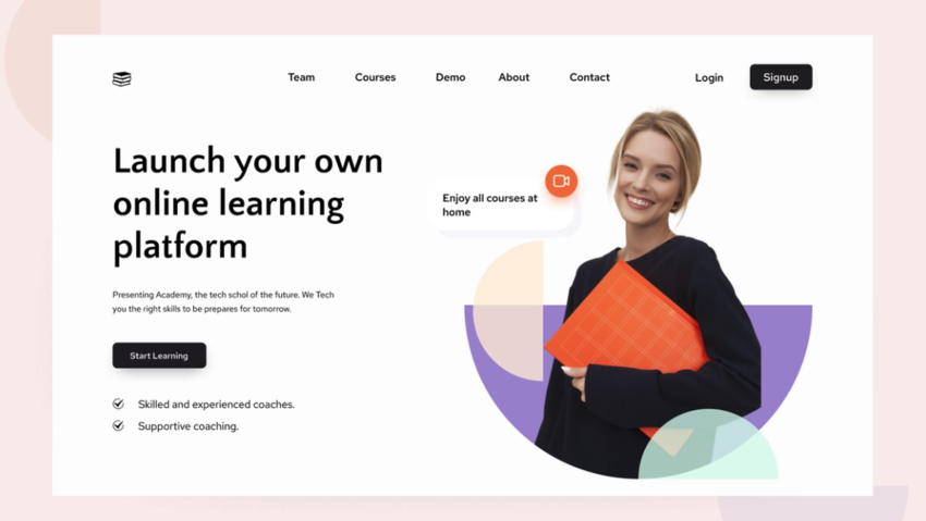
- Call-To-Actions
We have already discussed the necessity of smooth navigation for a website. And CTA (Call-To-Action) buttons do the same, growing the possibilities of converting visitors to clients. They guide the users through a website.
While creating a CTA button, you must consider how to design it, where to put it, and what text to utilize. According to your website’s requirements, you can place a Call-To-Action button on every page.
- Animation
Animation is a crucial modern web design element that makes a website look more engaging and interactive when visitors scroll, click, or hover. Since users focus on movement, animation can grab more users’ attention.
Motion and animation can create playfulness, causing visitors to spend lots of time on a website. Here are a few things to add as animation designs to your website:
- Spinning elements
- 3D motion
- Playful button or cursor
- Navigation menu animation
- Rotating images
- Semi-Flat Design
Flat design is more convenient for users to understand, and it can load more rapidly on websites with no tricky or excessive-tech elements. Many companies have moved to flat design, as it helps visitors understand website content more effectively.
Whether you design your site with a flat design or use shadows or some other elements, it must be subtle and stable across the website. Also, please make sure the whole website and its pages and sections use the same design cues to help visitors understand what they are viewing.
- Card Design
Many organizations are executing card designs these days. Cards help distribute data visually so the visitors can understand your website without being confused. If you break up your content pieces into cards, users can choose which content they want to read.
It keeps a website streamlined and cleaned, and there won’t be a bulk of the content. Many B2B and B2C companies are now using card designs to provide easy-to-read info for users. The design of your website can help highlight crucial products, services, or solutions side-by-side.
However, make sure to keep your cards responsive. As the screen size becomes larger or smaller, the displayed card size and number must change accordingly.
- Mobile-Friendly Website Layouts
Mobile-friendly website layouts follow the standard of responsive web design. It enables website elements like user interfaces, text, and images to resize and rescale automatically based on the device users use for accessing your website.
As of April 2022, 59.5% web traffic comes from mobile devices. This clearly means that your website must be mobile-friendly. If images, text, and buttons don’t resize to match smaller screen sizes and touch screen controls, potential clients cannot discover what they seek.
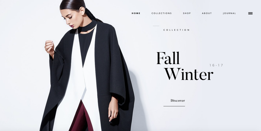
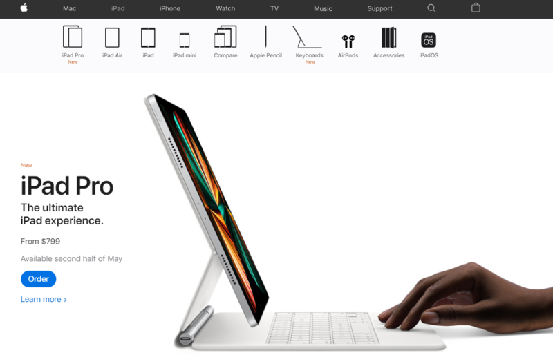
- Hero Images
A full-screen image as the base of a website’s homepage is another famous web design element. Hero images are the most extensive-sized banner images to put above the fold to attract more users and grow their interests.
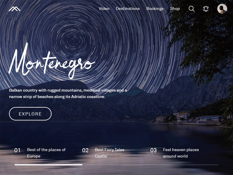
Keep hero images simple for the users to read the text above them. The text must have a bigger size and a contrastive color if it intersects with the navigation menu. It ensures clear visibility.
- Hamburger Menus
The benefit of long website menus is that they can lead the visitors to where they need to go. However, they consume lots of screen space. The hamburger menu doesn’t do the same. They save space, and users can navigate more effectively.
Your web pages must show a straightforward way of navigation for users. So, reducing busy navigation makes the user experience distraction-free and smooth. And it allows users to collect the data they want for doing an action.
Final Thoughts
We have discussed some of the most standard web design elements to make the most beautiful website and give it a personal touch to make it more attractive in users’ eyes.
Many more design elements are there for designing websites, but you can follow these basic ones discussed above to make a good start.
Blog Source- https://www.mindinventory.com/blog/modern-web-design-elements/